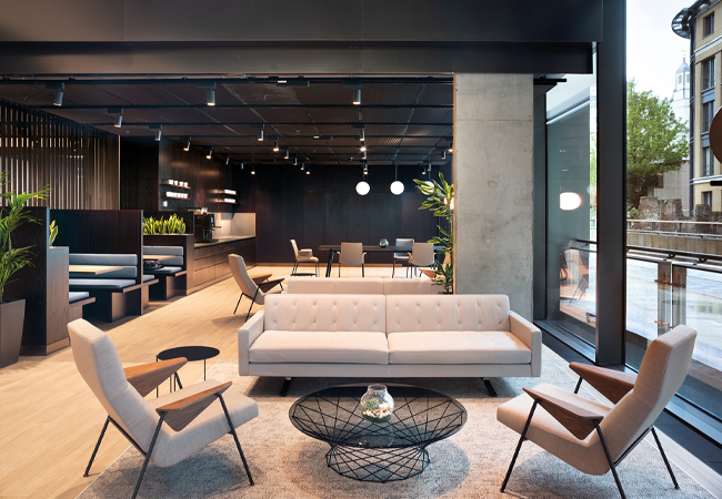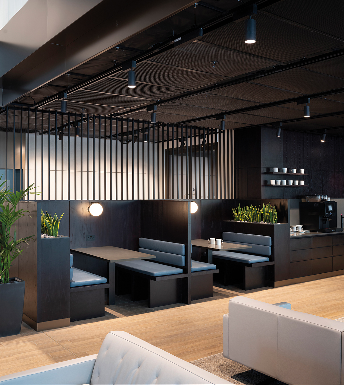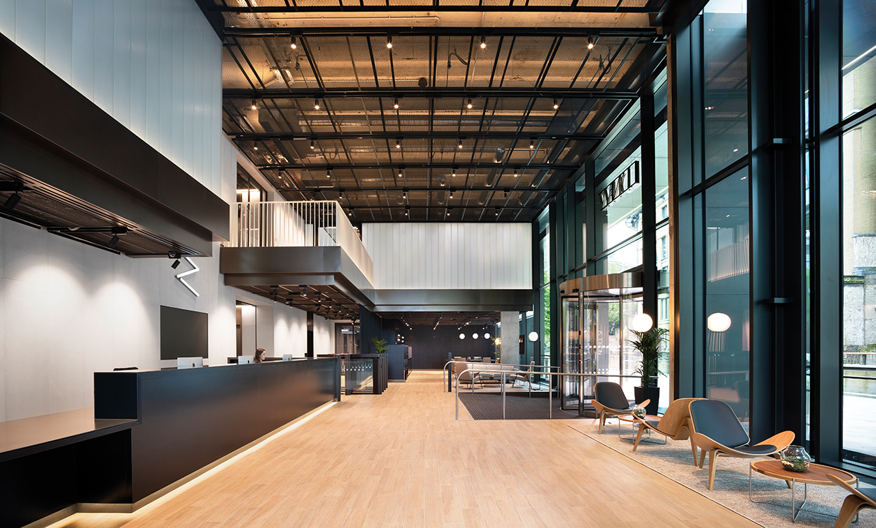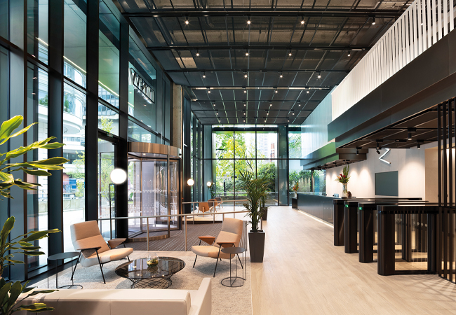
The office's unique colour palette of black with black meant standard lighting could not be used
There has been much discussion and research in recent years on productivity and concentration in the workplace, and how brighter ceilings and cooler temperatures improve people’s wellbeing. The Well Standard defines this in terms of quantifiable melanopic lux ratios, which can be translated very simply: our eye/brain system evolved to be awake during daylight hours and to contemplate around a warm fire, before sleeping in darkness.
Over the past few years, we have noticed a gradual shift in the approach to lighting. The bright spaces, dramatic use of colour and showpieces of previous decades have evolved into a more subdued, warm glow – a form of lighting that is perhaps encapsulated by hygge, the Danish word for the calmness of feeling the moment.
This sense of creating an inviting glow from within depends on darkness to frame it, and on allowing that warmth to glow out. Clients and users have responded quite dramatically to schemes where we have used darkness as an energy-saving device to meet carbon zero or exemplar targets.

Vertical and horizontal surfaces are illuminated according to the tasks taking place
This involves fully exploiting daylight where it is available and only using artificial light to balance contrast. What has been interesting is that, when these daylight spaces are allowed to darken down, our clients do not want them brighter. Instead, they appreciated the warm ‘business class’ mood of their interiors.
Whether for leisure or work, the greater use of screens increases the amount of time each day that we stare into the cool, blue, strobing light that keeps us stimulated and concentrated. The need to balance this is also growing – future places for work and leisure need to offer quieter, warmer, darker spaces as an alternative.
The following BDP project – LDN-W, an office development in London EC2 – is a good example of this trend, and reflects the way in which it is possible to incorporate a darkness element into a lighting scheme successfully.
A newly refurbished office building, LDN-W comprises 12 floors of Cat A office accommodation, a reconfigured, semi-public ground floor with innovative structural glazing, a new façade at street level, and a rooftop terrace with impressive views across the city.
On a general level, vertical and horizontal surfaces are illuminated according to the specific tasks taking place, supplying the building users with a comfortable and safe environment that is easy to navigate. Lighting is appropriate for the character and function of each space within a coherent, rationalised illumination system of lit effect and lamp types. This enables good passive security and maintenance, while also maximising lamp life and minimising energy consumption.
Timing occupants as they entered the foyer was essential to the success of the scheme
However, the unique palette of black with black, with more black throughout, meant that standard lighting could not be used. Any light on a black finish only reveals scratches and dust. The scheme intentionally adds angles of light up to the threshold of perceived visual tolerance, to narrow the occupant’s iris, making the black finishes rich and dark in lustre, but by using contrast instead of light.
The backlighting to the ceiling in the ground-floor foyer produces a warm upward wash to the fine-finished concrete behind the mesh. This produces a high-level wash, achieving a bright daylit ceiling while maintaining the presence of the black mesh as a translucent layer.
This technique works if the relationship between neighbouring materials is carefully managed so that floor, ceiling and wall finishes involve at least one matt, warm pale material to provide a diffuse reflector to the rest of the space.
The end result still produces a lit interior without glare or spill light affecting the quality of the blackness of the space. The room may appear black, yet you can read in any location and clearly see your companions throughout the space. It uses a cost-effective, sustainable and energy efficient control system based on presence detection for any area outside the ground-floor foyer.

A continuous, recessed, in-ground diffuse LED luminaire on the concrete panel wall creates a soft wash of light in reception
Lighting inside the main entrance, reception and cafe area is provided by high-level LED spotlights mounted on runs of track with a continuous, indirect LED light source. The track is suspended between the panels of expanded mesh ceiling, within an exposed slot, at a height that allows the spotlight head to project below the underside level of the ceiling. This produces an indirect wash of light to the existing concrete coffer ceiling.
An integrated, diffuse LED striplight at the front of the reception desk – and a continuous, recessed, in-ground diffuse LED luminaire on the concrete panel wall behind – create a soft wash of light.
Suspended LED feature pendants give direct lighting to the bar and create a visual focal point for customers. Floor-standing LED feature lighting provides low-level lighting to the cafe seating area for a more relaxed and informal ambience.
Continuous, direct, diffuse LED lines of light run around the entire perimeter of the lift lobby and circulation space. Luminaires are either suspended or surface-fixed, flush-recessed to the underside of the black, expanded mesh ceiling. Adjacent to the lift doors, deep-recessed LED downlights, mounted within a black profile system, produce pools of accent light on the timber floor.

Dark verticals in the foyer help the eye adjust when people step inside from the daylight
Timing occupants as they entered the foyer was essential to the success of the scheme. At the height of summer, occupants can step quickly into the building from daylight levels of 20,000 lux or more, potentially posing a problem for adjusting their eyes as they enter an interior with such radically dark finishes.
However, the intentionally dark verticals speed the eye’s adjustment to the lower interior levels. Once the occupant is in the interior space, the light is concentrated on the pale wall finishes to comfortably bring the eye’s focus to the lower light level, a process that can take up to two minutes. As the vertical black walls facing the daylight are five times brighter than the interior white walls, it is the pale walls away from the daylight that alleviate the transition. In other words, we are using a staged luminance transition to keep the eye comfortable as it adjusts over that two minutes.
Clients and users have responded quite dramatically to schemes where we have used darkness as an energy-saving device to meet carbon zero or exemplar targets
The balancing of contrast and focus to reflected light to any black finishes continues through each landlord space, into the toilet suites.
Task-focused light uses diffuse reflection to bring good facial modelling to mirror reflections. Lighting above the wash basin comes from a surface-mounted, flush-recessed line of LED light with opal diffuser, providing a soft lit effect, while indirect LED cove lighting detail gives vertical illumination above the mirror.
In all places, we understood the occupants’ eyes and direction of view, such that the lighting is as much about the balance and placing of black or pale finishes as it is about a standard approach to light levels.
About the author
Colin ball is lighting director at BDP
