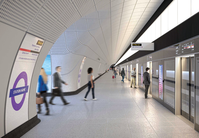
Crossrail, the new railway for London and the South East, runs from Reading and Heathrow to the west of the capital, through 42km of tunnels beneath London, to Shenfield and Abbey Wood in the east.
It will be known as the Elizabeth line when it opens to the public in autumn 2019, and will carry an estimated 200m passengers a year, increasing central London’s rail capacity by 10%. Integrating new and existing infrastructure, the project has included the construction of 10 new stations and the upgrade of 31 existing ones.
Within central London, there are eight new underground and two new above-ground stations, which are linked by a common identity created using standardised components. This unified set of architectural components and products form part of a line-wide design package for the public areas.
In 2009, a multidisciplinary design team developed the design strategy and, since then, has been working in partnership to integrate these essential components. The team comprises engineers and package leaders from SNC-Lavalin’s Atkins business, architects from Grimshaw, product designers and wayfinding experts from Maynard, and lighting designers from GIA Equation.
Platforms
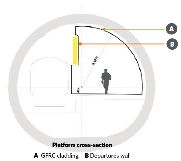
The PES has been developed as a services wall, with fully integrated ventilation, lighting, signage, customer information systems, cable management systems, speakers and line maps.
The platform lighting comprises a visually continuous series of evenly diffuse modular luminaires mounted on the PES. The height of the luminous section of the diffuser is 1.1m. Each module is 1.5m long and the array of PES luminaires should cover the entire length of each platform. The luminaire module is uniformly diffuse (a perfect Lambertian surface), reflecting primarily on the upper section of the vaulted ceiling and providing direct illumination on to the platform surface.
Secondary accent light is provided at help-point locations. In addition, train arrival – and passengers boarding and alighting – are assisted by tuneable, white colour-changing linear LED luminaires recessed into each door head within the PES structure. The light fittings change colour – from warm white when the PES doors are closed, to cool white when a train has arrived at the station – synchronised with the opening of the platform screen doors.
The detailed design involved developing full-scale working prototypes for all principal luminaire types, which were procured from several lighting manufacturers. The prototyping phase also included a full-scale mock-up of the platform space, including lighting.
This process allowed the assumptions made during the design stages of the project to be tested, photometric performance evaluated and product detailing to be refined. This avoided potential risks to project delivery, ensuring buy-in from stakeholders and enabling the proper testing of installation and maintenance procedures.
These initial prototype fittings became the client’s reference luminaires for several years, and served as an example to the design and build contractors of how to manage the luminaire design and fabrication for the final installation.
Spatially, the line-wide design encompasses aspects of the ticket hall, escalator, concourse and platform areas, and offers passengers an easy-to-navigate environment that is unique to the Elizabeth line. The consistent design language is strongest within the below-ground spaces of the five new tunnelled stations – at Bond Street, Tottenham Court Road, Farringdon, Liverpool Street and Whitechapel – because of their similar functional requirements.
Many of the features synonymous with an underground railway – such as tunnel linings, platform-edge screens, lighting and signage – are designed as a set of standardised parts that employ a coherent visual language, functional performance and geometry, to create a familiar feel for the Elizabeth line.
Passenger comfort and experience has been at the forefront of key decisions and innovations, and it is hoped the resulting design creates a quality experience for those moving through the stations.
Line-wide lighting concept
When appointed by the client 10 years ago, the Crossrail line-wide design team faced several challenges in creating forward-thinking lighting solutions for the central London stations. LED technology in the rail industry was not widespread at that time, and was not sufficiently well developed in 2009 to satisfactorily implement some of the principal lighting concepts for the sub-surface station spaces.
Nevertheless, by engaging with LED and luminaire manufacturers and OEM suppliers early in the design process, the design team was able to accurately predict how the LED lighting products and solutions were likely to develop and evolve over the subsequent five to 10 years. This gave the client team confidence to proceed with the completely LED-based lighting installations throughout the Elizabeth line.
Between 2009 and 2011, the GIA Equation design team – in partnership with Atkins, Grimshaw and Maynard – developed bespoke lighting solutions to a RIBA Stage F1 level of resolution for the sub-surface public areas of the central London mined (tunnelled) stations. These were successfully implemented by each station contractor.
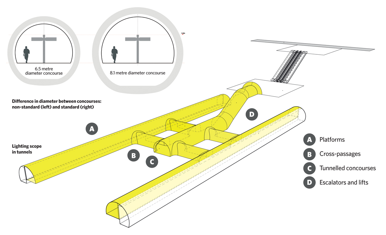
The lighting scheme for the sub-surface stations is designed to respond to and enhance the architecture of escalator barrels, the lower concourse, cross-passages and platforms. The lighting concept forms part of the client’s requirements for all central London stations, with particular focus on the five deep-mined stations.
The sub-surface stations have created unique interior spaces, with tunnel diameters 75% larger than the London Underground standard, and twice as long. These very long platforms, with possible exits in different areas from each station location, presented particular wayfinding challenges for the design team.
Escalator tunnels
The lighting scheme for the escalator tunnel was developed as two discrete elements. Functional lighting for the escalator steps was initially provided by the uniformly illuminated side panels. During the design and build phase of the project – once the concept design stage and the client’s requirements had been set – this was replaced by visually continuous escalator skirting lighting, which gives the required levels of task illuminance on the escalator itself. This task lighting is coupled with indirect lighting of the vaulted escalator tunnel, using deck-recessed linear LED uplights.
The escalator soffit is a key surface because it is directly in the sightline of passengers approaching the top of the escalators from each station ticket hall. The design intent was to create a welcoming introduction to the sub-surface environment by illuminating the vault overhead with a soft-edged wash of cool white light.
The escalator deck uplights will create a broad upward light distribution to the vaulted escalator tunnel, a soft-edged light distribution with graduated coverage across the vault, and a ‘darklight’ appearance to the luminaire itself. This is created by the black cross-blade louvre design, which ensures the luminaire does not create discomfort glare to passengers approaching and using the escalators.
A suspended illuminated sign at the top and bottom of the escalator gives additional task lighting at the locations where passengers step onto and alight from the escalators.
The low-brightness appearance of the luminaires will ensure a balanced lit environment, with the focus on the illuminated cladding surfaces and wayfinding elements of the design.
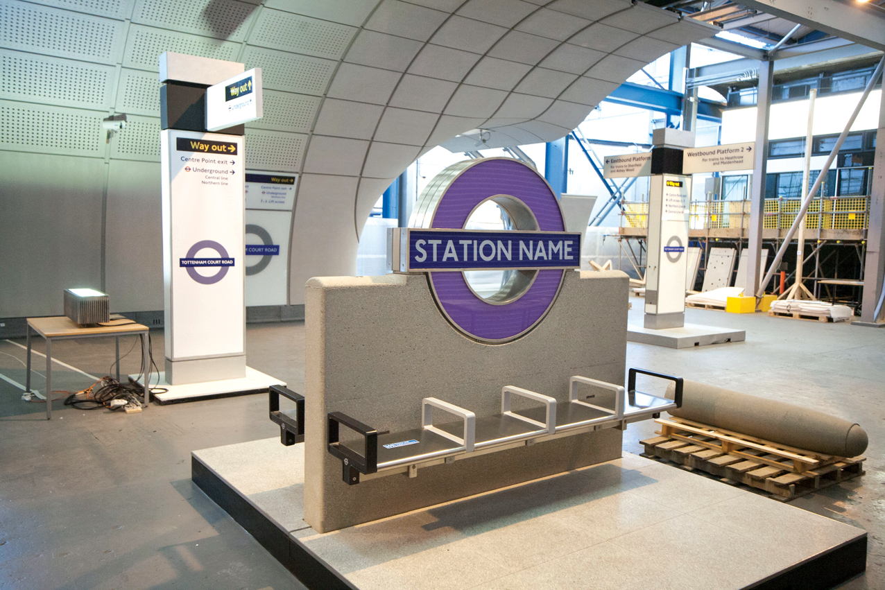
From an early stage in the project, the over-riding strategy was to group technology elements – such as services and lighting – into highly coordinated areas, such as freestanding ‘totems’, platform screen doors and ceiling-mounted service channels. The aim was to facilitate ease of installation and future maintenance over the design life of the equipment.
Indirect lighting within the concourses, escalator tunnels and platforms emphasises the interior public areas rather than drawing attention to the luminaires themselves. The light grey, matt-textured, glass-fibre reinforced concrete (GFRC) cladding of the sub-surface environment is illuminated with indirect light, which creates a sense of space and an elevated ceiling for passengers, staff and other users.
There is a clear distinction between the use of ambient and accent lighting. The former provides general illumination and the overall uniformity required for safe passage without creating harsh shadows. The accent lighting draws attention to specific areas and task surfaces, such as help points, signage, escalator landings and other identified visual tasks.
Accent- and task-lighting elements offer enhanced levels of local illuminance in accordance with London Underground standards, and the perceptual difference in illuminance values according to BS EN 12665:2018 Light and lighting. Basic terms and criteria for specifying lighting requirements.
Cross-passages
There are five standard cross-passage types, all illuminated by a flush recessed, overhead service boom. The system comprises a visually continuous service channel with integral linear diffuse LED luminaires mounted flush at the apex of each cross-passage. These are mounted end to end and periodically interrupted by speakers and CCTV cameras. They are accessible from below for maintenance via a hinged mechanism giving access to the cable management system.
Assisting wayfinding
The lighting design was used to influence intuitive wayfinding by the passengers and to assist their decision-making, whether when moving from concourse to platform or disembarking from a train and seeking an exit from the station. Thresholds, entrances and exits were clearly identified, and signage elements and passenger information highlighted.
Conceptually, the different public spaces in sub-surface stations were classified as either ‘wayfinding’ or ‘transit’ spaces with the following characteristics.
Wayfinding spaces:
- Multiple activities, such as reading signage, customer information displays, and identifying entrances and exits
- Multiple routes and decision-making required
- Gathering space
- Larger architectural volume.
Transit areas:
- Single-activity space
- Direct movement along a fixed route defined by architecture
- Transitory space
- Smaller, linear architectural volume.
Intuitive wayfinding is promoted by using visibly different colour temperatures for the lighting within adjacent spaces. Cool white (5,000K) is used for transition spaces, while warm white (3,000K) is applied within the wayfinding areas.
Vertical illuminance and visual comfort
Illuminance measurements are normally taken on the horizontal plane at ground level or on a specified task surface. Relevant standards and guidelines are primarily based on these criteria. However, humans process vertical surfaces within the visual field more easily and more often than horizontal ones. So, good vertical illuminance has been prioritised to improve facial recognition of fellow passengers, enhance the legibility of signs and information displays, and allow for the better detection of potential obstacles and hazards. The use of indirect lighting and of luminaires with large, diffuse, luminous surfaces creates a visually comfortable environment with fewer shadows and veiling reflections on materials and finishes. This also improves the lit environment for visually impaired passengers by minimising glare and improving the legibility of the space.
Lower concourse
Within the lower concourse, all technology elements are integrated into freestanding totems. These stand around 3.2m tall and incorporate lighting, loudspeakers and signage elements. The luminaires are located at the intersections with cross-passages and at intermediate points along the concourse.
Designated as a wayfinding space, the lower concourse is illuminated by warm white indirect light (3,000K) provided by the totem-mounted uplighters, which wash light up on to the vaulted concourse soffit to give ambient light.
The totems were designed to be spaced at 6-10m centres within standard 8.1m-diameter concourses and smaller 6.5m-diameter concourses. Both sizes required the same general light distribution and quality to be achieved.
Providing sufficient lumen output from the uplights to achieve the required levels of illuminance within the concourse was a significant challenge. Luminaire manufacturers were engaged by the client to develop early prototypes, built for fine-tuning lighting requirements, sharing designs with the contractor’s specialist designers, setting quality and material coordination standards, and facilitating early buy-in from project stakeholders and progressive assurance in advance of the final contractor design. (Read ‘Alight here for Crossrail’, September 2018 CIBSE Journal).
To avoid potential discomfort glare to passengers travelling down the escalators, an integrated louvre system was proposed for the uplights, to be installed within the totem uplights located nearest to the base of the escalators.
Architectural integration
The various luminaire components are carefully integrated into the architectural design. Services, lighting and other technology elements are grouped together and separated from other fixed elements, such as cladding systems.
The luminaire types specified have a similar aesthetic and visual appearance, to create a coherent narrative, in harmony with the architecture. They are integrated into other components, such as the totems in the lower concourses, or mounted flush within cladding elements, such as the cross-passage service boom.
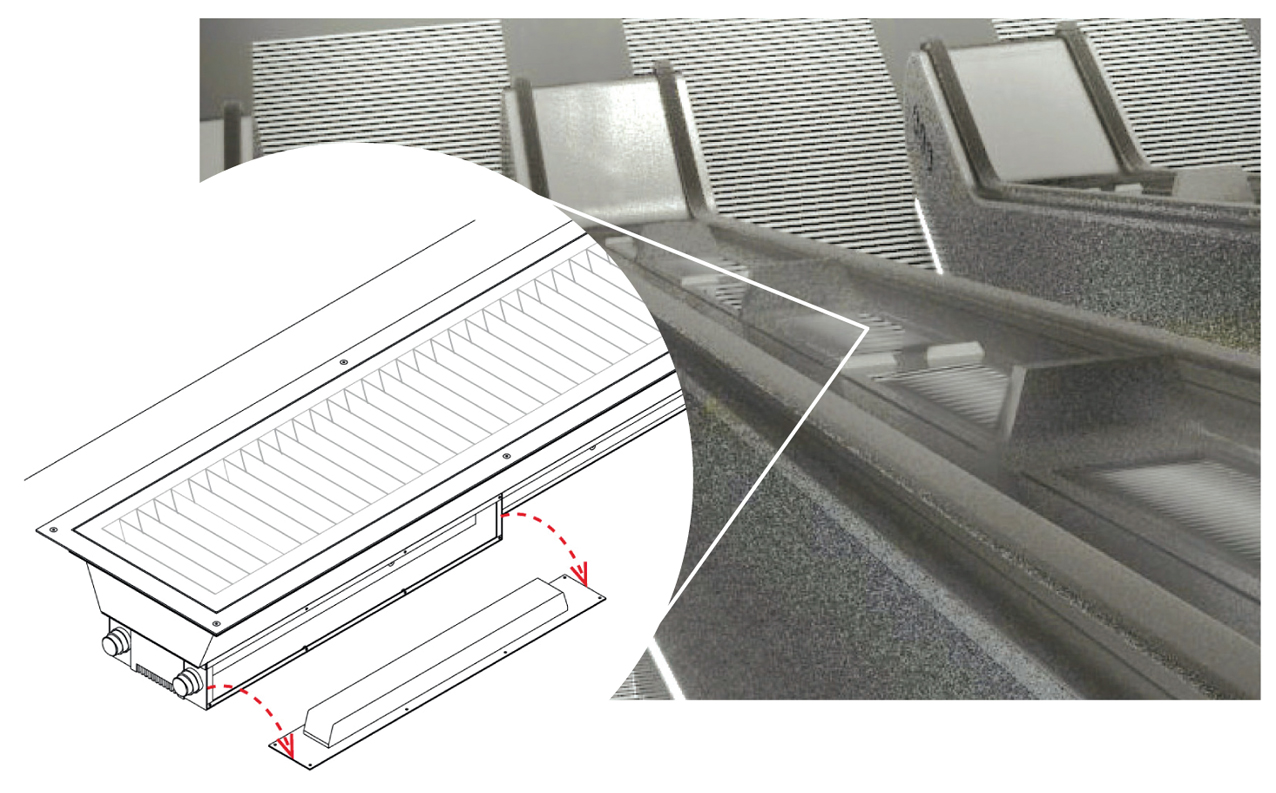
Side access to luminaire driver unit on escalator deck uplighter
Visible luminaires are typically conceived as a visually continuous, linear arrangement of luminous panels, which contributes to a consistent visual language across the Elizabeth line sub-surface environment.
This highly integrated application of linear lighting elements helps fulfil the architectural intent of creating an environment that is simple to interpret and free from visual clutter. It facilitates ease of maintenance and replacement, as luminaires and other lighting equipment have a shorter design life than the surrounding fixed architectural components, such as GFRC cladding. Emergency lighting has been designed to be fully integrated within the standard luminaire types.
The lighting design of the Elizabeth line sub-surface stations has created visually comfortable spaces with fewer shadows and veiling reflections. This enhances the legibility of the space and promotes intuitive wayfinding for all customers.
- Keith Miller is director of lighting consultancy GIA Equation
